Where the techniques of Maths
are explained in simple terms.
Calculus - Differentiation - interpreting diagrams and statements.
Test Yourself 1.
- Algebra & Number
- Calculus
- Financial Maths
- Functions & Quadratics
- Geometry
- Measurement
- Networks & Graphs
- Probability & Statistics
- Trigonometry
- Maths & beyond
- Index
NOTE: The solutions give detailed discussion of how to approach these interpretation questions.
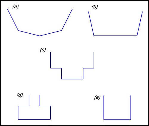
| Interpreting a diagram. | 1.
The graph above shows the depth of liquid in a symmetrical bottle against time when it is filling with liquid at a constant rate of 3 cm3 per sec. Which of the following diagrams shows a possible shape for the cross section of the bottle?
Answer.(d). |
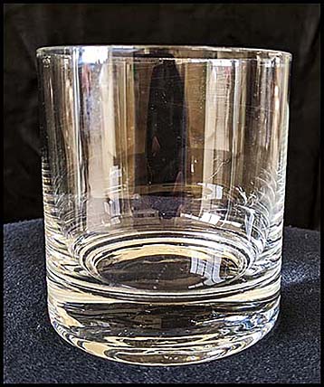
| 2. Water is poured into the 250 ml glass shown below at a constant rate of 10 ml/sec.
Draw a possible graph showing the volume of water in the vase against time. |
|
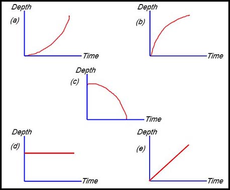
| 3.
Water is being poured into the glass shown above (that part above the stem) at a constant rate. Which of the following graphs describes the change in the water level over time?
|
|
|
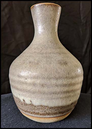
4. Water is poured into the vase shown below at a constant rate of 6 ml/sec.
Draw a possible graph showing the depth of water in the vase against time. Identify the two points where the rate of change in the depth is greatest and then least. Provide reasons to support your claim. |
5. 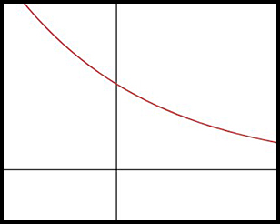
Which of the following statements are true for the curve in the above diagram? Answer. (c). |
|
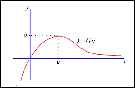
| Interpreting a graph. | 6. The graph of a function y = f(x) is shown in the diagram below.
On the same set of axes, draw a neat sketch of the derivative function y = f '(x). |
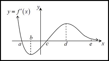
| 7. The graph below represents y = f '(x). Values a, b, c, d and e are written along the x-axis.
|
|
8. 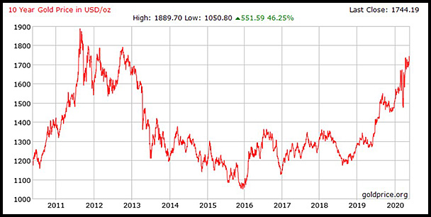
The graph above shows the price of an ounce of gold over a Think of a smooth curve going through the points rather than the jagged appearance which is the more common presentation. Comment on the shape of the graph in terms of the slope and the concavity over the following time periods:
|
|
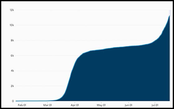
| 9. The graph below shows the cumulative number of COVID-19 cases in Australia to about 15 July.
|
|
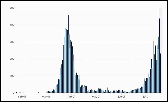
| 10. The graph below shows the daily number of COVID-19 cases in Australia up to 15 July 2020.
Source ABC News (18 July 2020). Draw the derivative graph showing the pattern for the rate of change in the number of cases by day. |
|
| Interpreting statements. | 11. The population of a coastal town in increasing at a decreasing rate.
Draw a sketch to show this pattern. |
| 12. Sketch a possible curve where f (x) < 0; f '(x) < 0; f "(x) < 0. | |
| 13. Draw a sketch showing a curve whose behaviour is described by the following statement:
f(x) > 0, f '(x) < 0 and f "(x) > 0. |
|
14. A function is defined as follows:
Sketch a possible graph of the function. |
|
| 15. The graph of the number of COVID-19 virus infections in a given locality begins at Day 10 with 15 infections.
On Day 16, the rate of infection begins to increase rapidly. It reaches a maximum number of 75 people infected on both Day 24 and 25. Following the maximum infection rate, the curve decreases at an increasing rate until Day 34 when there are only 6 infections and so the slope of the curve is flattening. Draw a graph showing the number of infections over time for this locality. |
|
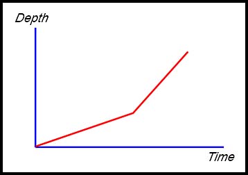
16. A dam in a particular rural area was at 70% capacity in the early stages of a prolonged drought. The volume V of water in this dam is monitored as a normal precaution over a period of time t. During the monitoring period, the volume decreased at an increasing rate due to the drought continuing over a long period.
|
|
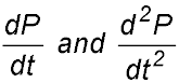
| 17. The median price of a house $P in a particular locality is falling at an increasing rate over 6 months from its maximum value in January due to the outbreak of a virus. After 6 months, the price continues to fall but more slowly.
What does this tell you about |

 > 0.
> 0.